Analyzing AirBnB Listings - The Impact of 2015 Regulations
In this project, I analyze Airbnb listings in Paris with a focus on pricing trends and the impact of regulations introduced in 2015.
Table of contents
- 00. Project Overview
- 01. Data Overview & Preparation
- 02. Pricing Trends in Paris
- 03. Impact of 2015 Regulations
- 04. Key Insights
- 05. Conclusion
Project Overview
Context
As Airbnb has grown in popularity, many cities have introduced regulations to limit the number of properties listed. Paris, one of Airbnb’s most active markets, saw significant regulatory changes in 2015, aimed at curbing short-term rentals. This analysis is an exploration of the impact of 2015 regulations on pricing trends and market dynamics.
To achieve this, I analyzed Airbnb listing data for Paris, focusing on:
- Pricing trends across neighborhoods
- Price differences based on accommodation capacity
- The number of new hosts over time and potential effects from regulations
- And the overall effect of 2015 regulations on host activity and pricing
Actions
To conduct this analysis, the following steps were taken:
- Data was imported and cleaned
- Data was QA’d to ensure accurate analysis
- I filtered down the listings dataset to only Paris listings
- Data was reshaped (aggregated) for analysis
- I created a helper function to add a formatted subtitle
- A 1 page report with the relevant visualizations was created
Analysis TL;DR
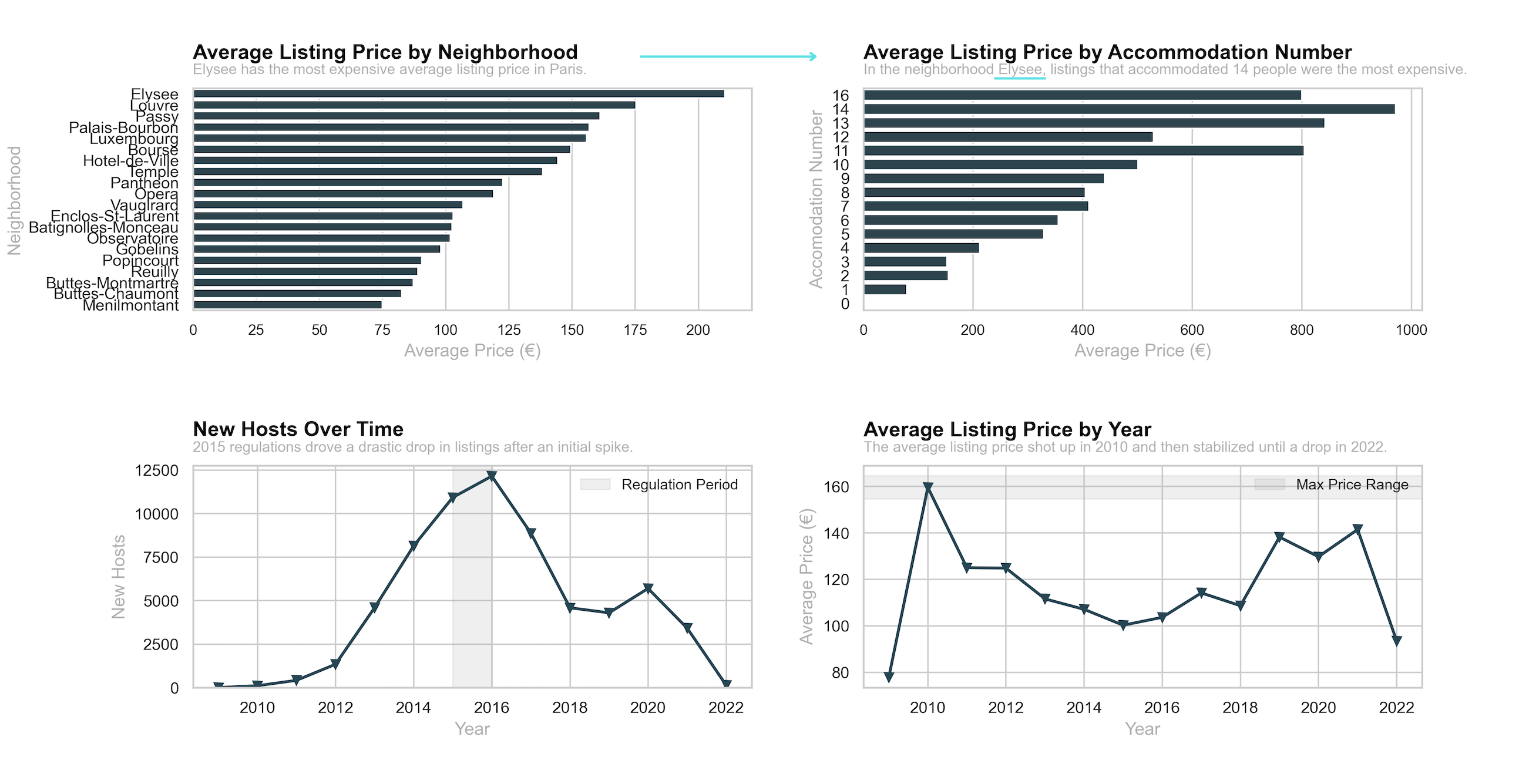
- New hosts entering the Paris market dropped significantly in response to 2015 regulatory changes
- Despite a drop in listings in response to regulatory changes, the average listing price continued to rise until a recent drop in 2022, this could potentially be attributed to market adjustments
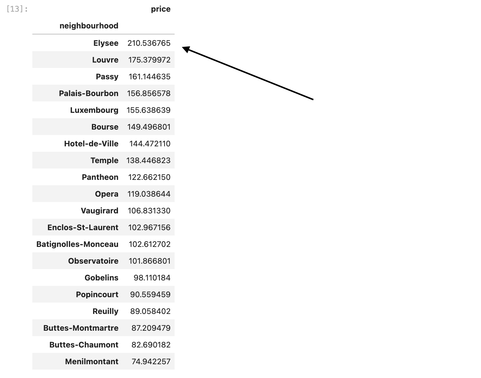
- Elysee was the most expensive neighorhood.
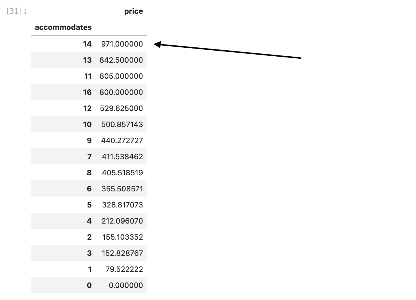
- In Elysee, the general price of an accommodation has a positive relationship with the size of the accommodation.
Data Overview & Preparation
Loading and Cleaning Data
First, I had to import the data. I had to ensure the encoding was correct and also parsed host_since to convert to a datetime.
import pandas as pd

# Load dataset
# Read in AirBnB data
path = '/######/######/######/######/######/######/Airbnb Data/Listings.csv'
df = pd.read_csv(path,
                 encoding = "ISO-8859-1",
                 low_memory = False,
                 parse_dates = ["host_since"]
                )
# Explore first few rows
df.head()
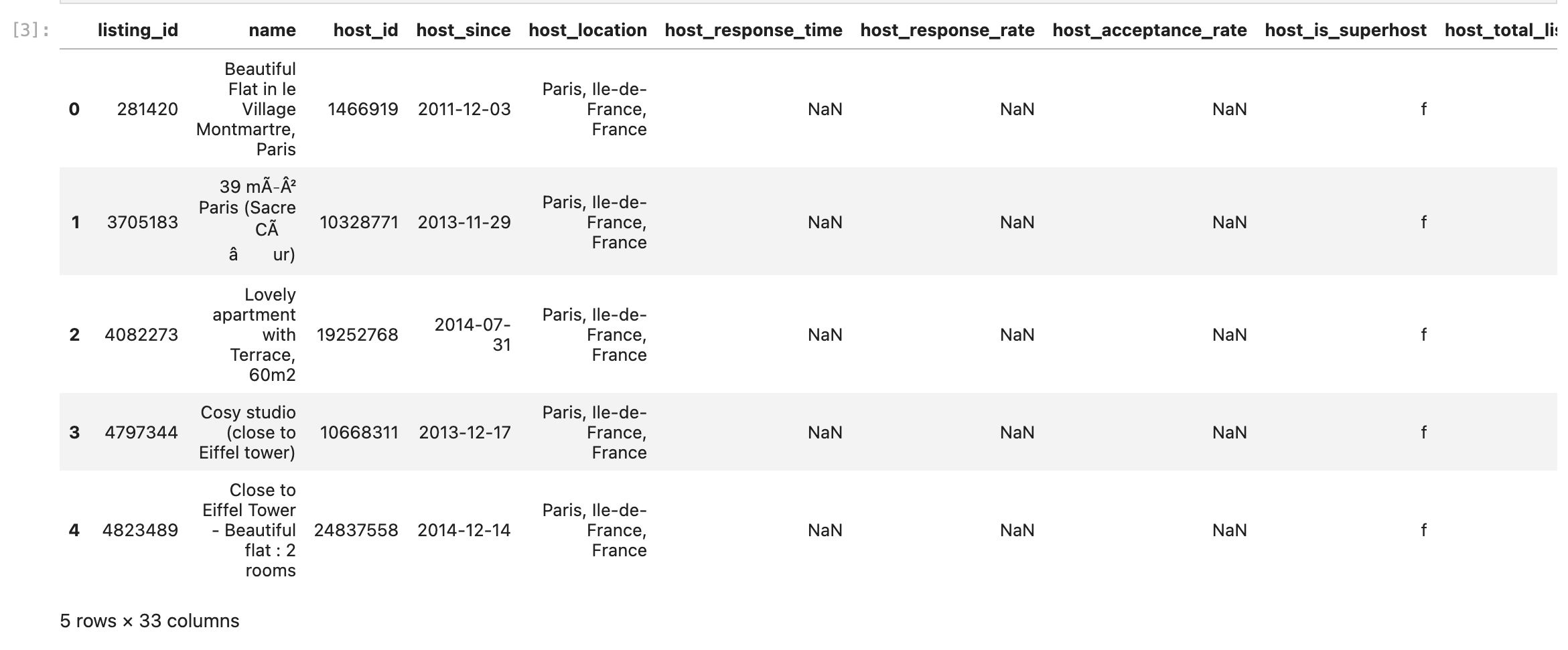
After that, I wanted to ensure that the data was read in correctly. So I used .info() to look for missing data and ensure the columns were of the correct data type.
# Check the data types of columns
df.info()
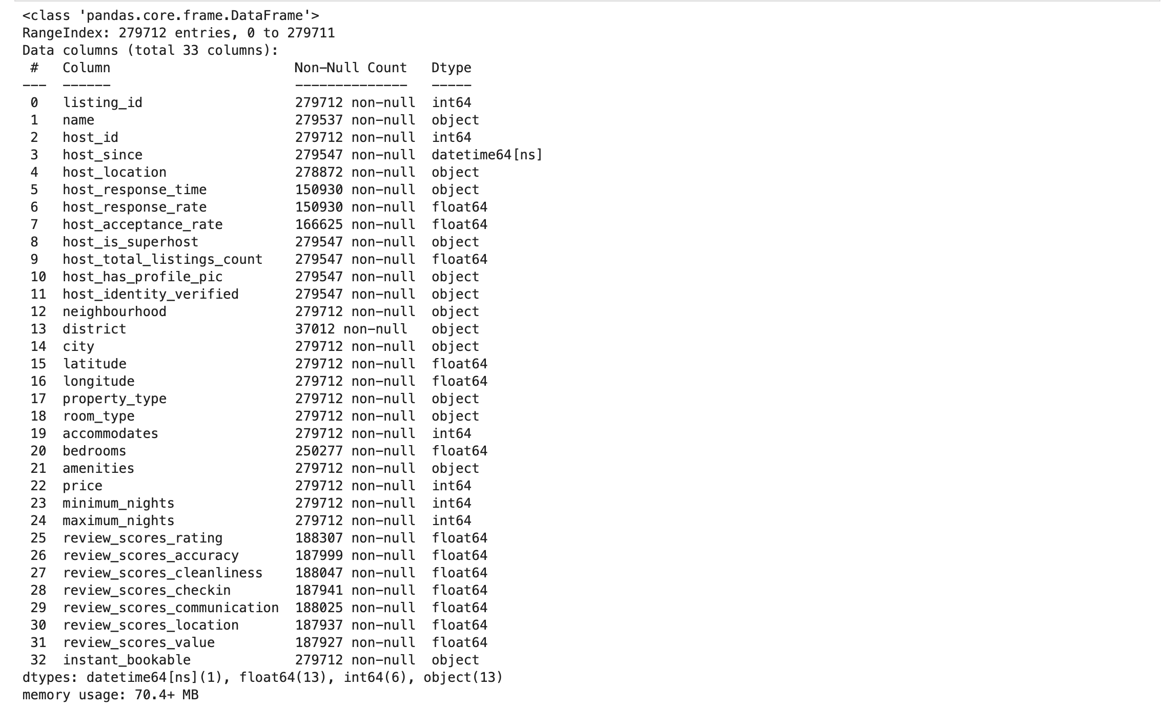
Following that, I filtered the data down to records where the city was Paris. Finally, I grabbed every row for a select set of relevant columns.
# Use Query to filter down
paris_listings = (
    df
    .query("city == 'Paris'")
    .loc[:, ["host_since", "neighbourhood", "city",
             "latitude", "longitude", "property_type", "room_type",
             "accommodates", "price"]]
)

paris_listings.head(10)

QA the Data
Next, I wanted to look at the missing entries of the dataset to see if it would potentially skew our data. There were 33 missing entries in the host_since column. Not enough to impact our data so I proceeded.
# Check the missing listings
paris_listings.isna().sum()
.png)
Then, I profiled the numerical columns of our datasets using the .describe() call.
# Profile our numeric columns
paris_listings.describe()

I noticed the accommodates column had a minimum of zero so I wanted to see just how many. So did the price column.
# Count How Many times Accommodates = 0
paris_listings.query("accommodates == 0 ").count()

# Count How Many times price = 0
paris_listings.query("price == 0 ").count()
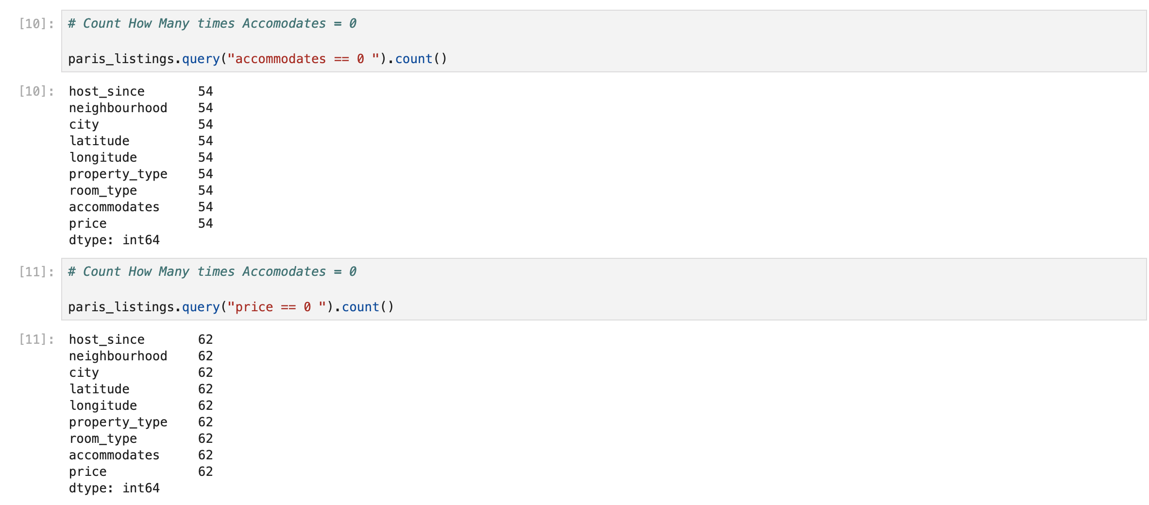
Accommodates had 54 rows with zero and price had 62. Neither had s significant number of records with zero so I opted to keep them.
Data Aggregation
First, I needed to create a dataset that would allow me to visualize the average price of each neighborhood. To do this I performed an aggregation by the neighbourhood column and got the average price at that level. Then, I sorted the values in descending order so I could visualize the rows in descending order.
# Group by Neighbourhood
paris_listings_neighborhood = (
    df.groupby('neighbourhood')
    .agg({'price': 'mean'})
    .sort_values(by="price", ascending=False)
)
Zooming in on Elysee, I wanted to drill down into the average price of each listing based on their accommodation size. I found that there was a positive relationship between price and number of people the listing accommodated.
# Filter Data for Accommodations in Elysee
paris_listings_accommodations = (
    df.query("neighbourhood == 'Elysee'")
    .groupby("accommodates")
    .agg({"price": "mean"})
    .sort_values("price", ascending=False)
)
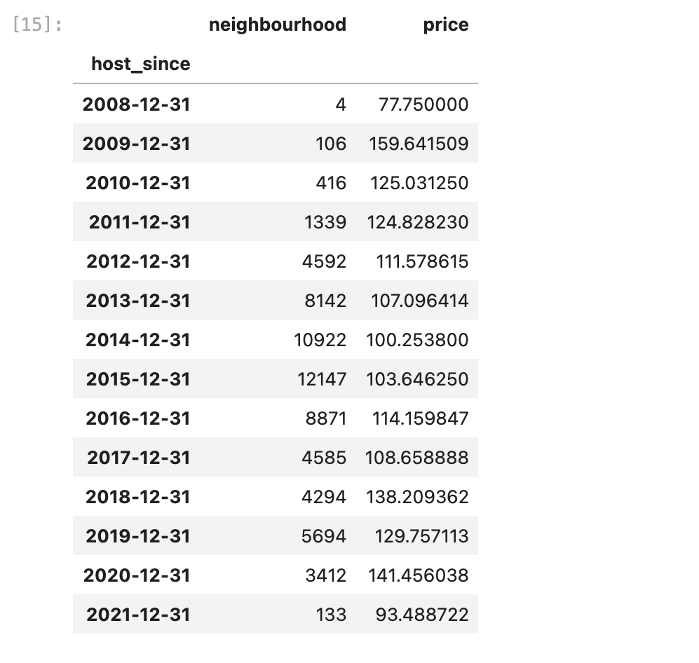
Zooming back out, I thought it made sense to look at pricing trends over time for the Paris market. So I aggregated the data at the yearly level and got the count of listings so we could see how many new listings entered the market each year.
- I wanted to see if the regulations had any impact on new hosts entering the market.
I also aggregated average price of listings at the yearly level.
- For the same reason, I wanted to see if there were market reactions to the 2015 hosting regulations.
# Create a time-series dataset
paris_listings_over_time = (
    df.set_index("host_since")
    .resample("YE")
    .agg({
        "neighbourhood": "count",
        "price": "mean",
    })
)
Pricing Trends in Paris
Average Price by Neighborhood
import matplotlib.pyplot as plt

# Plot neighborhood price data
fig, ax = plt.subplots(figsize=(10,6))
ax.barh(paris_listings_neighborhood.index, paris_listings_neighborhood['price'], color="navy")
ax.set_title("Average Price by Neighborhood", loc='left', fontsize=14, fontweight='bold')
ax.set_xlabel("Average Price (€)")
ax.set_ylabel("Neighborhood")
plt.show()
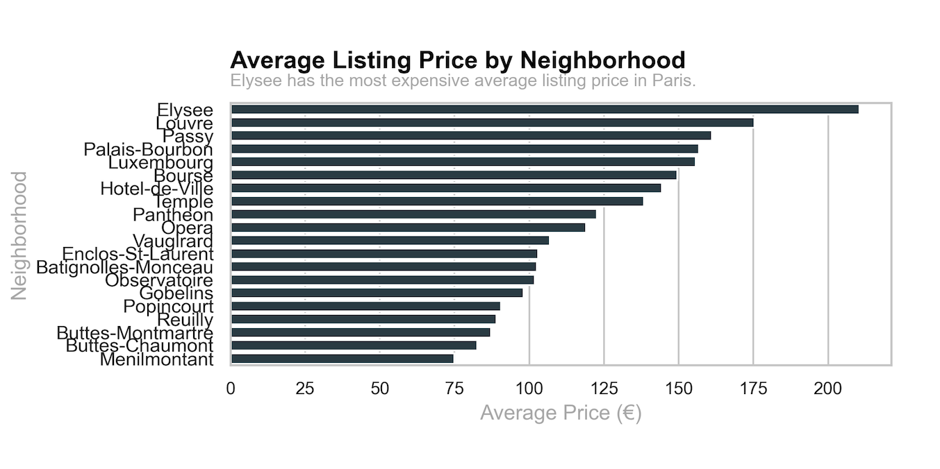
As we noted before Elysee was the most expensive neighorhood by a large gap. ~25 euro more expensive than the next closest neighborhood.
Average Price by Accommodation Size in Elysee
# Plot accommodates price data
fig, ax = plt.subplots(figsize=(10,6))
ax.barh(paris_listings_accommodations.index, paris_listings_accommodations['price'], color="navy")
ax.set_title("Avg Price by Accommodates in Elysee", loc='left', fontsize=14, fontweight='bold')
ax.set_xlabel("Average Price (€)")
ax.set_ylabel("Accommodates")
plt.show()
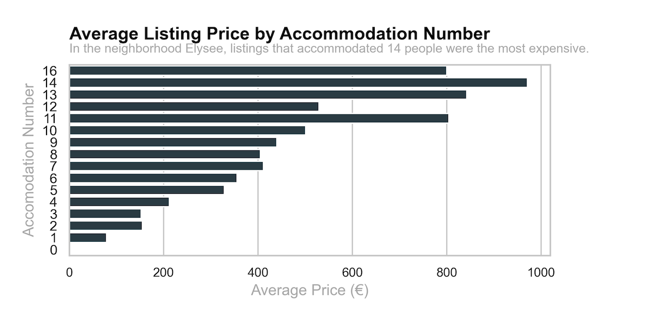
Looking at the pricing in Elysee, we observe the positively correlated relationship between accommodation size and average price. Interestingly, a listing that accommodates 14 people had the largest average price!
Impact of 2015 Regulations
New Hosts Over Time
# Plot new hosts over time
fig, ax = plt.subplots(figsize=(10,6))
ax.plot(paris_listings_over_time.index, paris_listings_over_time["neighbourhood"], color="navy", marker="v", linewidth=2)
ax.axvspan(pd.Timestamp("2015-01-01"), pd.Timestamp("2016-01-01"), color="grey", alpha=0.2, label="Regulation Period")
ax.set_title("Count of New Hosts Over Time", loc='left', fontsize=14, fontweight='bold')
ax.set_xlabel("Year")
ax.set_ylabel("New Hosts")
ax.legend()
plt.show()
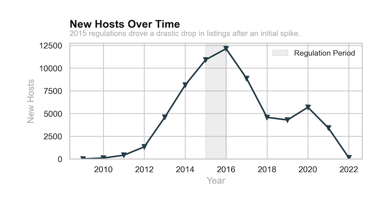
In 2015, there was a notable shift in the number of new listings entering the market. There was an initial spike, but a drastic drop between 2017 and 2018. The number of listings then stabilized and had a nother large drop in 2022.
Average Price Over Time
# Plot average price over time
fig, ax = plt.subplots(figsize=(10,6))
ax.plot(paris_listings_over_time.index, paris_listings_over_time["price"], color="navy", marker="v", linewidth=2)
max_price = paris_listings_over_time["price"].max()
ax.axhspan(max_price - 5, max_price + 5, color="grey", alpha=0.2, label="Max Price Range")
ax.set_title("Average Price Over Time", loc='left', fontsize=14, fontweight='bold')
ax.set_xlabel("Year")
ax.set_ylabel("Average Price (€)")
ax.legend()
plt.show()
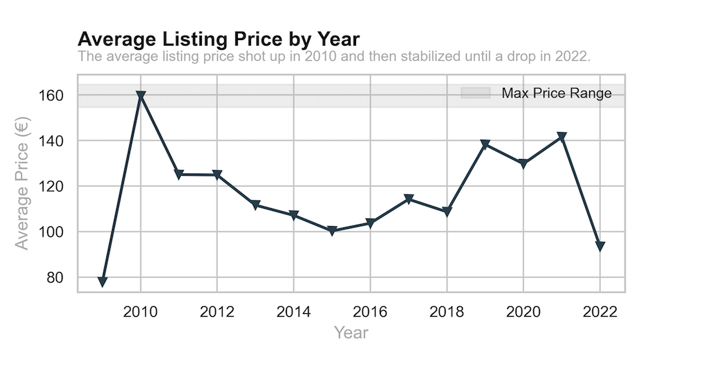
As for price adjustment, you could see the response of hosts after the 2015 regulations. Perhaps with hosts being unable to list multiple properties due to regulations, we see a hike in prices in 2019 to compensate for lost opportunities.
Key Insights
- Regulations Introduced in 2015 significantly reduced new host registrations
- Despite Regulations, Prices Have Increased Over Time
- Elysee Continues to be the Most Expensive Neighborhood
- Fewer Listings, More Competition, Higher Prices
Conclusion
- The 2015 Airbnb regulations had a strong impact on market entry, reducing new host participation.
- Pricing trends indicate that Airbnb remains lucrative in Paris, especially in high-demand neighborhoods.
- Further research could explore guest booking behaviors to understand whether regulations have impacted consumer demand or only host supply.
This analysis could prove useful for policymakers, Airbnb hosts, and investors, helping them better understand how regulations shape market dynamics in short-term rentals.
Appendix: 1 Pager Code
# Visualizations

navy_blue = "#264653"  # Main bar color
grey = "#B0B0B0"  # Highlight color
black = "#000000"  # Title color

fig, axes = plt.subplots(3, 2, figsize = (15, 12), gridspec_kw={'hspace': 0.7})
sns.set(style = "whitegrid")

# Helper function for titles
#def add_title_with_subtitle(ax, title, subtitle):
 #    ax.set_title(title, loc='left', fontsize=14, fontweight='bold', color=black, pad = 20)
  #   ax.text(0, 1.02, subtitle, transform=ax.transAxes, fontsize=10, color=grey, va='bottom', ha='left')

def add_title_with_subtitle(ax, title, subtitle, highlight_text=None, highlight_color=None):
    ax.set_title(title, loc='left', fontsize=14, fontweight='bold', color=black, pad=20)
    if highlight_text and highlight_color:
        subtitle = subtitle.replace(highlight_text, f"}{highlight_text}}}")
    ax.text(0, 1.05, subtitle, transform=ax.transAxes, fontsize=10, color=grey, va='bottom', ha='left')


# Bar chart 1
sns.barplot(x = paris_listings_neighborhood["price"], y = paris_listings_neighborhood.index , ax = axes [0, 0], color = navy_blue)
add_title_with_subtitle(axes[0, 0], "Average Listing Price by Neighborhood", "Elysee has the most expensive average listing price in Paris.")
axes[0, 0].set_xlabel("Average Price (€)", fontsize=12, color=grey)
axes[0, 0].set_ylabel("Neighborhood", fontsize=12, color=grey)
axes[0, 0].tick_params(axis='x', labelsize=10)


# Bar Chart 2
sns.barplot(x = paris_listings_accommodations["price"], y = paris_listings_accommodations.index, ax = axes[0, 1], color = navy_blue, orient='h')
add_title_with_subtitle(axes[0, 1], "Average Listing Price by Accommodation Number", "In the neighborhood Elysee, listings that accommodated 14 people were the most expensive.")
axes[0,1].set_xlabel("Average Price (€)", fontsize = 12, color = grey)
axes[0,1].set_ylabel("Accomodation Number", fontsize = 12, color = grey)
axes[0,1].invert_yaxis()
axes[0, 1].tick_params(axis='x', labelsize=10)

# Line Chart 1: New Hosts Over Time
axes[1, 0].plot(paris_listings_over_time.index, paris_listings_over_time['neighbourhood'], color=navy_blue, marker="v", linewidth=2)
add_title_with_subtitle(axes[1, 0], "New Hosts Over Time", "2015 regulations drove a drastic drop in listings after an initial spike.")
axes[1, 0].set_xlabel("Year", fontsize=12, color=grey)
axes[1, 0].set_ylabel("New Hosts", fontsize=12, color=grey)
axes[1, 0].set_ylim(0)

# Add vertical shading for a specific period (e.g., 2015 regulation period impact)
axes[1, 0].axvspan(pd.Timestamp("2015-01-01"), pd.Timestamp("2016-01-01"), color=grey, alpha=0.2, label="Regulation Period")
axes[1, 0].legend(loc='upper right', fontsize=10, frameon=False)

# Line Chart 2: Average Listing Price by Year
axes[1, 1].plot(paris_listings_over_time.index, paris_listings_over_time["price"], color = navy_blue, marker = "v", linewidth =2)
add_title_with_subtitle(axes[1, 1], "Average Listing Price by Year", "The average listing price shot up in 2010 and then stabilized until a drop in 2022.")
axes[1, 1].set_xlabel("Year", fontsize = 12, color = grey)
axes[1, 1].set_ylabel("Average Price (€)", fontsize=12, color=grey)

# Add shading to indicate the maximum price
max_price = paris_listings_over_time['price'].max()
axes[1, 1].axhspan(max_price - 5, max_price + 5, color=grey, alpha=0.2, label="Max Price Range")
axes[1, 1].legend(loc='upper right', fontsize=10, frameon=False)

# Remove final chart on the bottom right and use the space for insights
axes[2, 1].axis("off")
axes[2, 0].axis("off")

plt.tight_layout()

# Save the figure as a PNG file
plt.savefig("paris_airbnb_report1.png", dpi=300)

plt.show()